CASE STUDY
Budget your everything.
BudgetWise is a progressive personal finance management mobile and web app that provides users with a one-stop-shop for budget organization, savings goal creation, and financial awareness.
Overview

Optimize user flows across mobile app for seamless experience. Enhance visual design for better legibility and overall consistency of icons and illustrations.

Role

UI/UX Design. Interaction Design. Visual Design. Illustration.

Team

Veronica Gu, Product Manager
Sydney Huang, UI/UX Designer
Toni Galang, UI/UX Designer

Deliverables

Interactive hi-fi prototypes.
Design iterations.
HQ illustrations.
SVG icons.

Duration

February 2023 - July 2023

Exploring the Problem

Though I came on to the team after initial design decisions and the roadmaps were already created for the most part, I had to ensure my work would align with the path BudgetWise intended to go down since my work spread across the entire iOS app. To do this, I familiarized myself with our existing research work courtesy of the PMs.

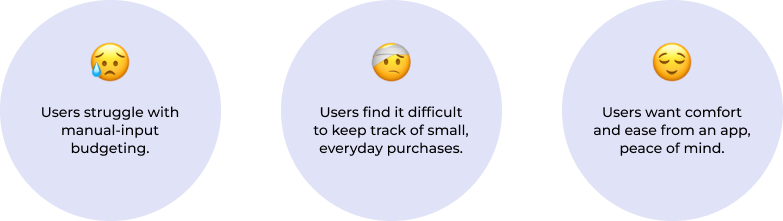
Users who have little to no experience with budgeting find it hard to get started with an app experience. But why?

Users need a beginner friendly, easy-to-follow experience within a budgeting app that will help improve their spending habits and assist their savings progress. Upgraded process from manual input to automated would be key.

Research: Interviews

A handful of ideal users were interviewed to gather further information to ensure BudgetWise is on the right track.

Users answered in common patterns that allow us to conclude that as a whole, they are looking for familiarity, ease of use, and automation.

Research: Turning Findings to Features

How might we directly address the concerns of our users?

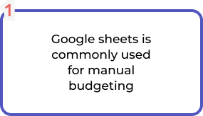
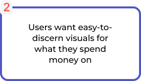
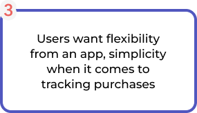
1. allow for google sheets connectivity2. visual spending categories and amounts on both homepage and trends3. Connect to bank accounts & credit cards, recurring transactions4. simple, easy-to-follow flows with tooltips directing first-time users

Since google sheets is essentially a standard to users who budget on their own, allowing them to connect sheets to the app will increase their ease of use and decrease the workload of a new budget method.

Users being able to see their   spending in real time, as represented by our categories with interesting colours and icons, will give them a better overview of their financial habits than words and numbers could alone.

The call for automation is high, so allowing users to connect transactions directly sourced through their bank accounts into their budgets, and recognizing recurring transactions, will increase the overall experience.

Optimize user flows across mobile app for seamless experience. Enhance visual design for better legibility and overall consistency of icons and illustrations.

By implementing features in direct relation to our findings, BudgetWise can begin to overcome the hurdles it was presented with.

User Goal

Easily accessible and user-first app that keeps their financials in one place that simplifies money management.

Business Goal

Increase user retention and attract new users by offering features such as automated budget tracking and expense categorization.

Design Goal

Intuitive and user-friendly interface that is easily navigable with a clear and consistent layout.

Creating Consistency

Now that we know our key components that might set us apart, we must create a consistent and appealing design that will keep users coming back and enjoy their experience across all aspects of the app; to not let one area of the app seem out of place.

There were some things from the previous designs that needed to be addressed to get this process started.

The designs before I joined the team were only able to use free placeholder icons and illustrations found through online resources, ones that had varying styles from each other and stroke to fill inconsistencies.
Using my illustration skills, I took this challenge head-first and made BudgetWise custom icons and illustrations to be used within the app.

Iconography
Icons before v after

Through making the icons myself, I was able to create a consistent and clear style across all of the category and navigation icons within the app. The icons are one of the main factors in the app, being used to label a user’s spending categories within the budgets they create, and I found the inconsistency within the designs to be quite distracting and wanted to make amends to that from day one.
The colors were later also updated with the go-ahead from stakeholders to be more legible and easier to differentiate ones that would appear close to each other in lists.

Illustrations
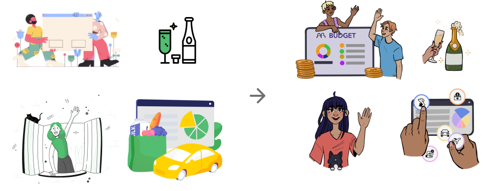
Illustrations before v after

The illustrations within the app are situational and some are seen only once on the user’s first time through the app, but I felt that the same amount of care should be given to them as with the icons to ensure the app felt cared for and polished across the board.

Moving into Design

Design Updates

As previously stated, I came on to the team after initial design decisions and the roadmaps were already created for the most part. As such, there were designs within our file that were created by the designers of the cohort before mine, which were not yet in development and I was tasked to ensure the rest of the app retained the same consistency and visual interest.

No section of BudgetWise was sent to development without my hand having touched the designs to send it forward.

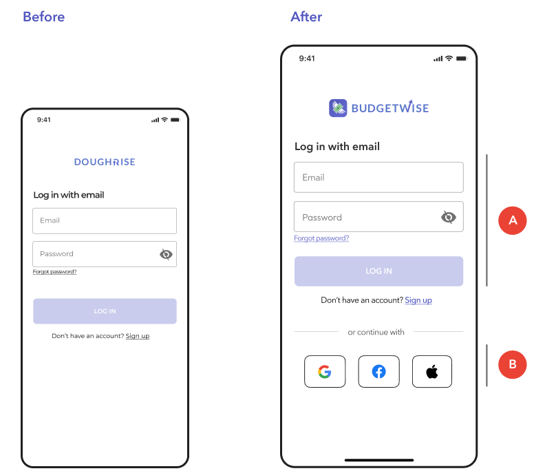
A. Consistent spacing - Allows keyboard to rest under login button without obscuring it.
‍B. Alternative login - In case users meant to use another account, not get trapped on email. Escape route.

Stakeholders wanted to emphasize social logins to promote their usage over using email, so I added them to the page to further encourage the options.
Colouring and spacing were updated to ensure the click space of buttons wasn’t compromised and make secondary buttons more obvious.

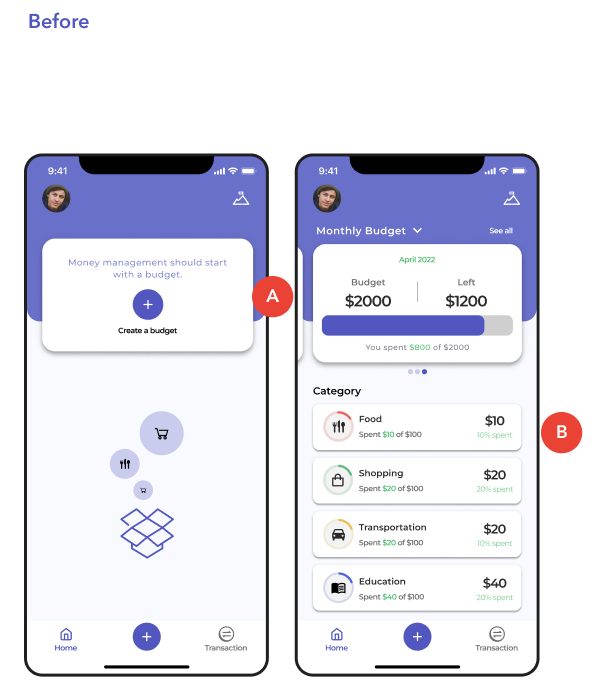
Before img 2

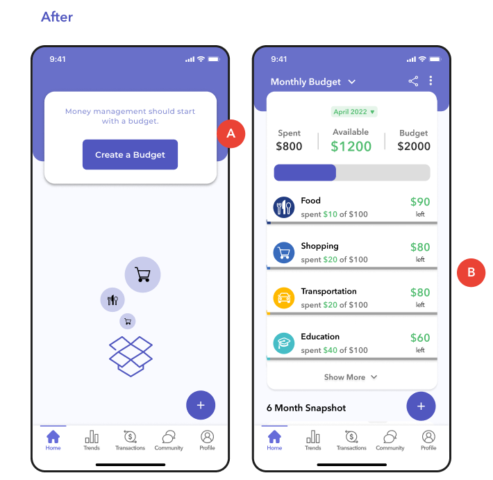
A. Button confusion - The two circular plus buttons had different use, but appeared the same. Changed primary CTA to text button.
‍B. Reduced scroll - Budget information became a single card. Misc buttons at top of screen relocated.

When I joined the team and began looking through our design file, I had gone through the experience blindly as a user would on their first entrance to the app. With that, I had thought the circular plus button at the bottom was used to create budgets, since that is what it is used for when a user first opens the app and is met with the empty state. However this is not the case, and the button of this style is used primarily for adding transactions to the selected budget.

The redesign of the homepage was not led by me but by Sydney Huang, but I felt like it was important to show alongside the empty state. It can still get a bit crowded and the scroll can still be on the longer end depending how many categories a user has in the selected budget, so I can foresee some potential updates there so that the widgets under the budget won’t be hidden to first time users.

Before img 3

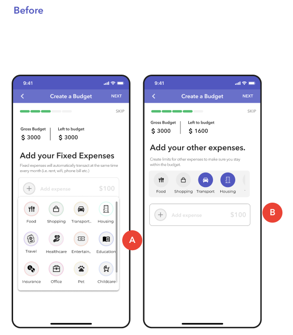
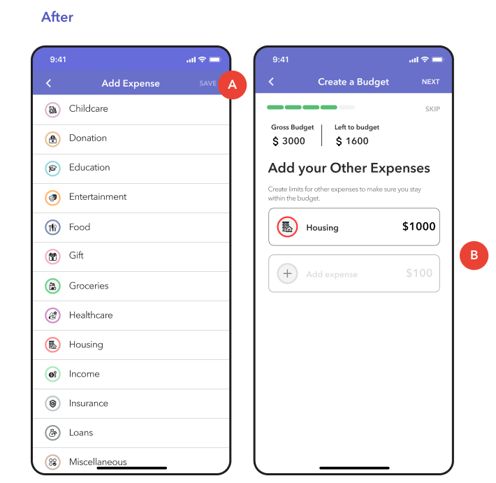
A. Expense window - Easier visualization of available categories in easy-to-navigate list.
‍B. Mirror selection screens - All expenses follow the same rules, rather than have a side scroll wheel for ‘other expenses’.

Previously, there were two ways to select expenses to add to the budget: a drop-down window, and a scroller that also showed the categories which were selected previously in the Fixed Expenses. This was changed to be a popup window that uses a simple list form and made adding expenses a uniform experience, no matter if the user was added a fixed or ‘other’ expense.

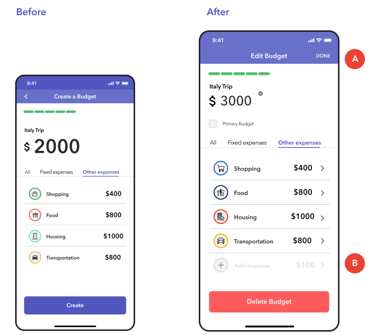
A. Edit before creation - Upon finishing the budget creation, user previously had to go back through the budget process one by one to edit anything added. Now, users can edit all at once before they click Create.
‍B. Add new expense - While editing, if a user had forgotten to add anything, they will not need to go back to the original screens.

Users needed a way to be able to edit their expenses without going back to the pages they were originally added. This edit page was a quick fix to take pressure off the devs, but it is not the most ideal since the user needs to take extra steps to click to ‘edit’ the budget and to save their changes. For a future iteration, we would hope to allow this functionality just on the final review page before the budget is created for ease of use.

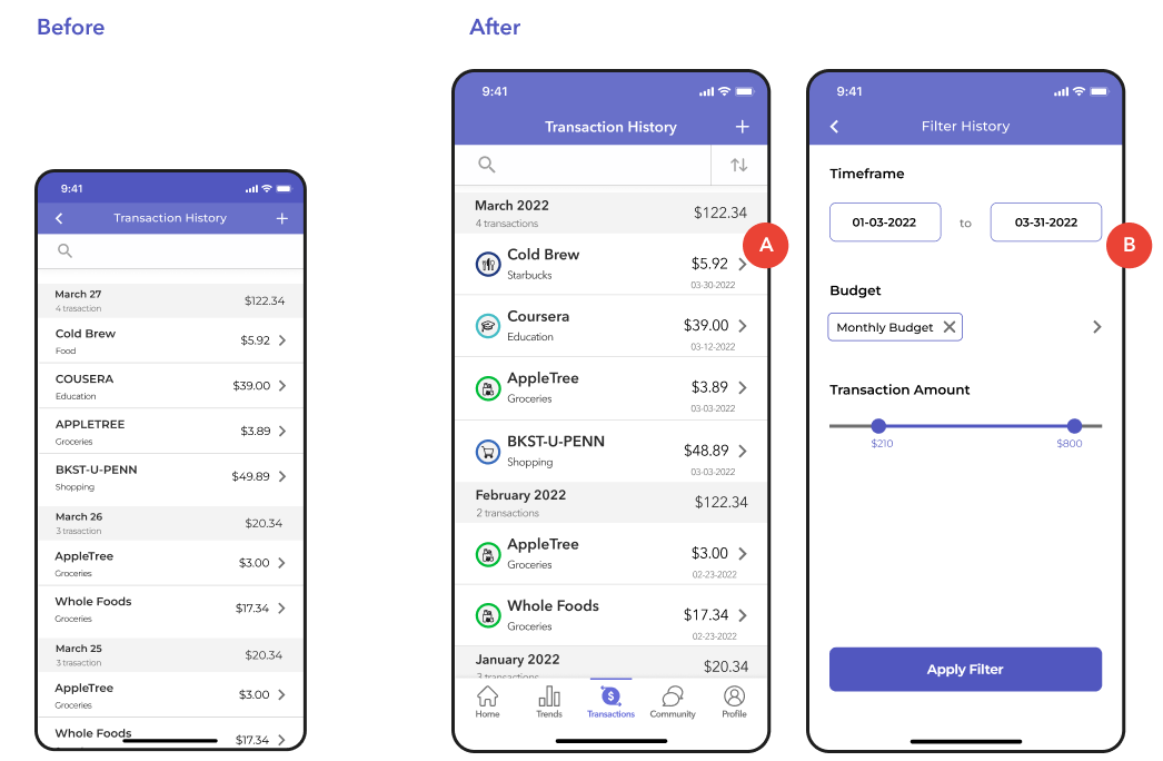
A. Visual categories - Break up the text-heavy page and add visual confirmation of categories for easier scanning.
‍B. History filtering- Make searching past transactions more manageable by allowing users to narrow their search.

Users needed a way to be able to edit their expenses without going back to the pages they were originally added. This edit page was a quick fix to take pressure off the devs, but it is not the most ideal since the user needs to take extra steps to click to ‘edit’ the budget and to save their changes. For a future iteration, we would hope to allow this functionality just on the final review page before the budget is created for ease of use.

Interactive Prototype

All of my work on BudgetWise was presented in clickable prototypes. 
Being perhaps the most important part of the app, I have chosen to showcase here the flow for Creating and Editing a Budget.

Final Thoughts

Takeaways

While V1 of these changes has yet to be launched at the time of my writing this, and there will still be some final testing before it hits the app stores, it was a great experience to work on a team with close stakeholder-design team interaction.

I feel that I was able to learn quite a bit from the process of our sprints, and to get opinions from other designers as well as the stakeholders was essential in the making of this app and its progress.

Next Steps

While the MVP is currently still in development, BudgetWise still has some unfinished aspects to address where users experience pain points on other apps, such as the Bank Account Connectivity to introduce automated budget creation and monitoring.

We can project to increase oncoming users by 50% with the initial upcoming launch and with the addition of a marketing expert to our team.